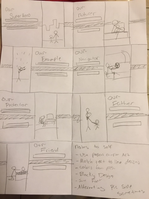
6A slide design project from Sierra Cobb
Speakers Outline
- Fathers are our Super Heroes
- They save the family
- Big fundamental part of the family
- They are our protectors of the “city” (home)
- They protect us spiritually, physically, and mentally
- Protect our confidence, give us strength and backbone
- They are our examples of the families
- Daughters learn how to be treated
- Sons learn how to treat wives, and children
- They are our Friend
- Definition of friend is…
- Someone who wants to give support
- Attached by feelings of affection
- Strong relationship with father important
- Definition of friend is…
- They are our nurturers
- Help us grow, Teach us right and wrong
- Teach us how to love
- Help guide our path, and are our navigators
- Want to help us return to our heavenly father.
- Help Herd family vessel to heaven
- Most important, they are Our Father
- Each father different
- Specifically, best for that family
- We are specifically their child
- They know us best
Process
The last two years on father’s day I was asked to give a father’s day talk. I decided to combine my two talks from both times into one (with some additives) and make it into a presentation. I was looking for father’s pictures and found one by a guy named Pascal Campion. I decided to use his pictures because I found out he had tons that would work with each other and all the same type of art. I then pulled colors from the to the background and text and blocks which I added for emphasis. I added the blocks to add more style and a more unique theme. I had the color of them correlate with the font colors. The Audience I was aiming for was families so I used warm settings in pictures and things that all ages would appeal to.
Critique Process
For my critique I had two comments about how the first slide and the example slide were the only ones that were plural. I then just took out the plural form and made them singular with the rest of the slide. I also got a critique from Sister Peterson About how I had to Fonts that were more playful. She suggested an old-style or sans serif text. I did change to a Sans serif text and contrast to the script of The “Our” in the slides. I also got critique about realigning my fonts and blocks. I moved the two words closer together and made sure they didn’t cramp with the blocks I had added. I also made a lighter background on the “friend” slide like she had suggested.
Link to talk: I wrote this talk and actually I give talks in an outline like this
Fonts: Microsoft JhengHei (sans serif), AR BLANCA (script)
Links to images: Superhero, Protector, Example, Friend, Nurturer, Navigator , Father, All art by Pascal Campion, I believe this is his blog

I would first start with how much I loved the pictures for the slides! The slides all followed together with the message that was being shared. The pictures showed repetition and they weren’t all over the place so it was really neat. The color scheme was cool to see throughout the slides, this would be a great presentation to showcase!
LikeLike
I very much liked the continuing style of the lines behind your catch words. I also like the fact that all your pictures match each other and have a very good theme. The quailty and art style are really cool. Overall very good job!
https://megnicoledavis.wordpress.com/category/design/
https://lexhallblog.wordpress.com/
LikeLike
Awesome job on this!! I love the cartoons and I also just love the way you designed the horizontal lines that go with them. I also like the way you incorporated the color schemes with each slide. Good job again!!!
https://michaelabelbin.wordpress.com/2016/02/12/slide-design-powerpoint/
LikeLike
I love everything about your slide presentation, the photos, font choices, and design element. It’s an awesome topic and your images just add to that. The changes you made after the critique really elevated your project. I love that we can help each other take our ideas to the next level. Great job!
LikeLiked by 1 person
You should check out Jennifer Egger’s presentation. It’s beautiful!
LikeLike
I think the best part was that all the slides had a matching theme and the pictures were perfect! It totally represented what you were trying to say. I would give it a 10/10 for sure! Let me know what you think about my slides, I dint quite finish the rest but would love to hear what you think.
http://coultonwoods.vendness.com/slide-design-project/
Another one I liked,
https://nicolestock.wordpress.com/2016/02/12/slide-design-project/comment-page-1/#comment-11
LikeLike
Great work, I loved seeing your style and themes. I also like how you handled the critiques. check out my post https://jaredbrown2016.wordpress.com/category/design/
LikeLike
I love that your images are all the same. I really like how creative you were with the layouts of your slides. I also like the theme of your talk.
LikeLike
I forgot to leave a link: https://sydnihoppie.wordpress.com/design/
LikeLike
Great job Sierra!! I really loved your slide show. You did a great job with keeping the theme the same throughout the entire slide. You also did well with your complimentary colors and using the right colors with your pictures; it was clear to read all of your writing. I love the way you explained your project and how you wrote what inspired you. I can tell you took some time on this and you prepared it very well! Great work.
https://anniedayley.wordpress.com/2016/02/12/6a-slide-design-project/
LikeLike